Evgeniy Nepomnyashchiy is a 3D artist who specializes in making images for games, giving them a painterly or cartoon look. We spoke with him about his workflow for achieving his final result.
Read about how Evgeniy uses Corona Renderer to create his stylized images
Tell us a little about yourself – what is your job these days, and how did you get started in 3D?
Hello everyone. My name is Evgeniy Nepomnyashchiy. In the network I’m known as Bagstor, and I am a background and 3D-artist from Saint Petersburg. I work as a 3D-artist at a company called Kefir!
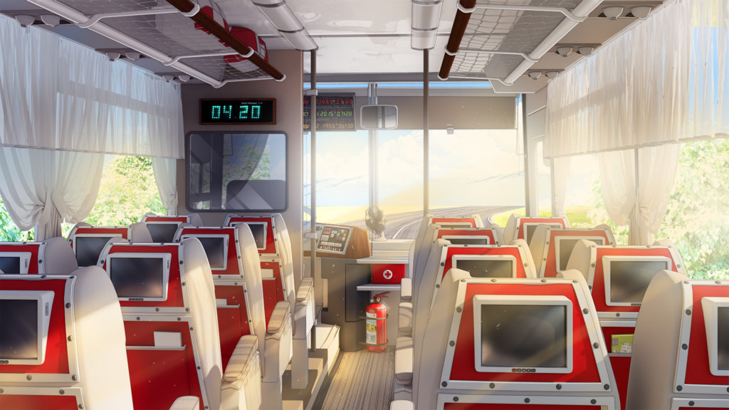
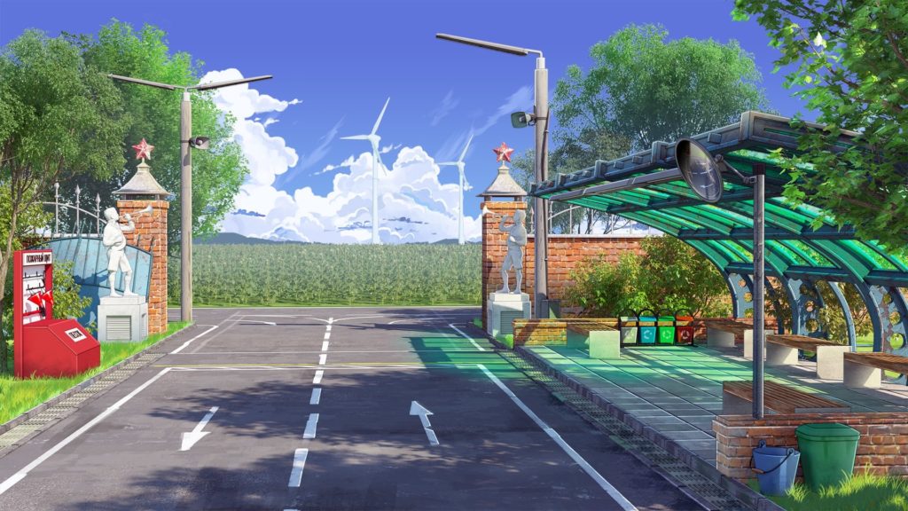
Besides my primary job, I am also taking part in the EON project, which is a visual short story about journeys to an alternate future world where the USSR exists.
How did you first discover Corona Renderer, and why do you choose to use it?
Before I joined the game development world, I taught visualization to students, architects and designers, and I learned about Corona Renderer back then while working as a teacher. Before Corona appeared, V-Ray was the most popular visualization engine, but it could be too complex for simpler things as interior and exterior visualization that needed less options and controls.
When I saw Corona Renderer for the first time, I was shocked – here was software which could be described by the old joke: “Some time there will be a program with just one button – make perfect”!
Above all, I chose Corona for its flexibility in setting up lighting with the help of the LightMix, and the simplicity of the settings for its materials.
You create beautiful stylized images with a lovely toon style look – what lead you to develop this style?
I am a big fan of anime; I especially like Makoto Shinkai’s works “5 Centimeters Per Second” and “The Garden of Words” which impressed me very much. In these films the surroundings stand almost in the forefront of the movies; the environment is a hero as well as the characters, and it helps to create the necessary atmosphere.
Then there are works of the other artists also impress me: Arsenixc, Sylvain Sarraihl, Pablo Carpio, Slawek Fedorczuk, and Sergey Orekhov.
Can you take us through the steps you use to create that look?
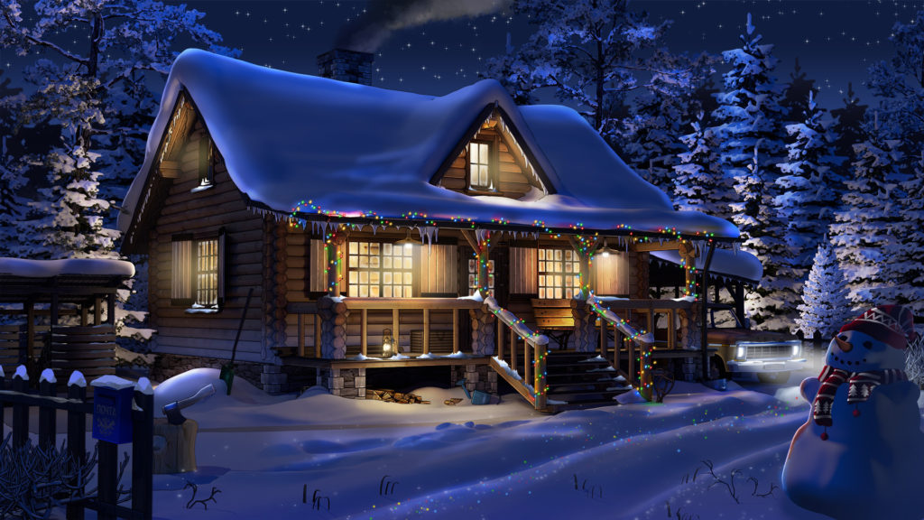
We can take a look at a particular image done for the game “Big Dipper”:
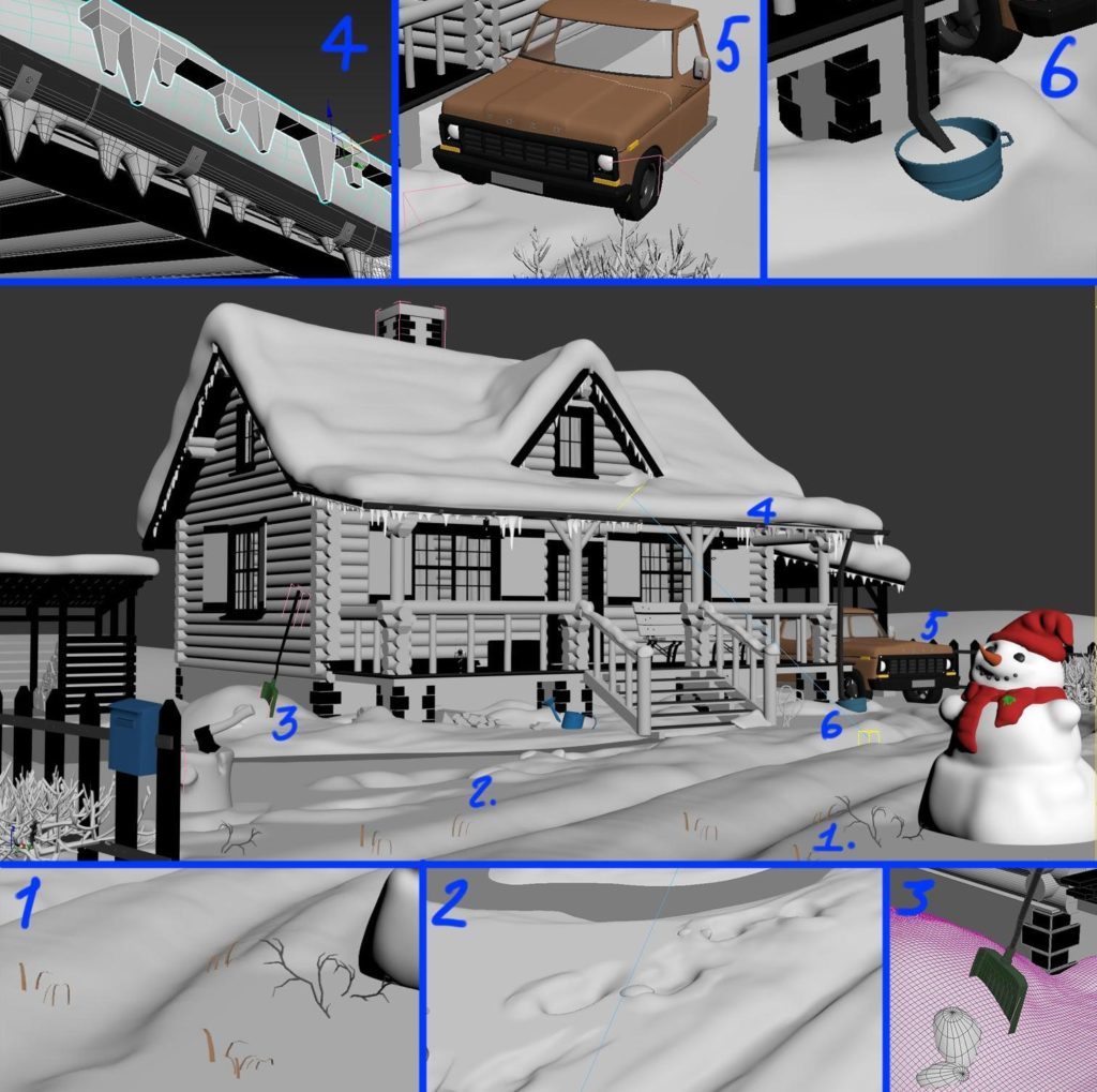
When creating my works, I always rely on certain key approaches. I numbered them on the image below:
1) I switch from general forms to specific details. Adding details will break the monotony of the image and allow the viewer to become absorbed in the scene. For example, these twigs and dry grass that broke through the snow in this image.
2) You need to keep in mind that background is telling a kind of story. Add dirt, dust, unevenly standing chairs, or traces in the snow. As there is nothing perfect, look at your own room for inspiration – probably there are places where there is a stack of old papers, some unwashed mugs, or an unevenly made bed. “Non-ideality” helps us breathe life into our image.
3) I try to add some “interest points” that can tell more about the inhabitants of this space. One of the basic rules is “show, don’t tell”. The background should work in isolation from our description.
4) Unlike the models for real time engines, we are free to use any number of polygons, so do not worry about the number of polygons and the correctness of the topology. All methods and tools are good! Also I try to add a little cartoon to our objects, things like round bevels, rounded shapes, or slightly increased proportions. Actors in the theater always deliberately do their make up defiantly, in a way that is over-the-top, so that their emotions can be seen at any distance. This rule works here too, you can always slightly exaggerate proportions or the overall size of an object for greater expressiveness.
5) A pre-designed composition will save you a lot of time. For example, when creating this car, I already knew that only half of it would be visible, so I worked harder on the front and did not waste time on the back. Plan your work carefully.
6) Use your personal experience, and make note of details in real life. In journeys, walks around the city, or just sat at home, make a note for yourself about the details that can help you in creating an image. The world around us is filled with thousands of interesting moments. For example, this basin is one that I took from my childhood memories, when I was staying with my grandmother in the village. She always put this basin there to prevent water spreading around the house.
What do your raw renders from Corona look like?
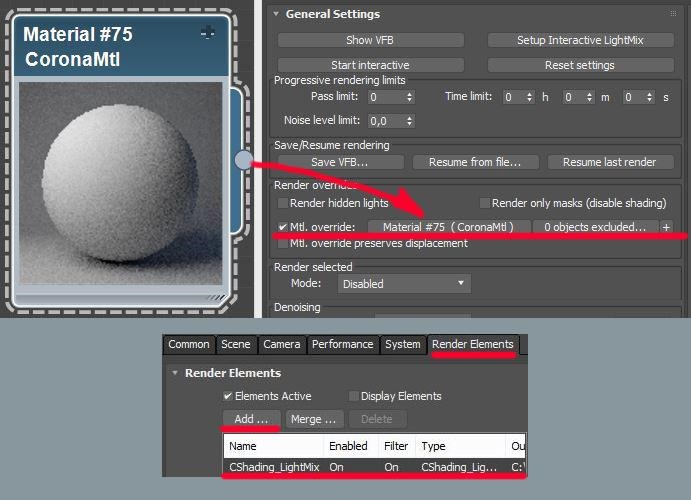
After I model a scene, I begin to adjust the lighting. I paint the objects in gray to make it easier for me to observe the look and the warmth of the lighting. To do this, first I create a gray-colored material and add it to the “render overrides” panel. This allows me to paint the whole scene in a single neutral material without losing the basic materials on the objects. In the “Excluded” panel we can add exceptions for mirrors and glass objects, as they affect how we will arrange the lighting.
After that we can arrange the lights and begin working in LightMix. This tool is simply irreplaceable, it allows me to configure every light in the scene in real-time, right during the render.
Talking about the materials, everything is kept as simple as possible; we don’t add shine or bump maps to our materials as our task is to get the most flat-looking render that we can achieve. All the glares and irregularities we draw in later, in Photoshop, to maintain a more painterly look to the end result.
However, what is really important for us to render is the ID mask with all the objects. Later in the process, they will help us to quickly choose specific objects in the scene. There are lots of options for adding and using such masks.
You can also render a separate image with Ambient Occlusion, which we can use to add detailing at the joints of objects in a cartoon style, and a ZDepth pass that will allow us to add some atmosphere to the image.
The most important pass is one with an absolutely white material with a contrasting AO. This pass will give us a stroke of all objects in the scene, and we can add it to the render in Photoshop by setting the layer to Multiply.
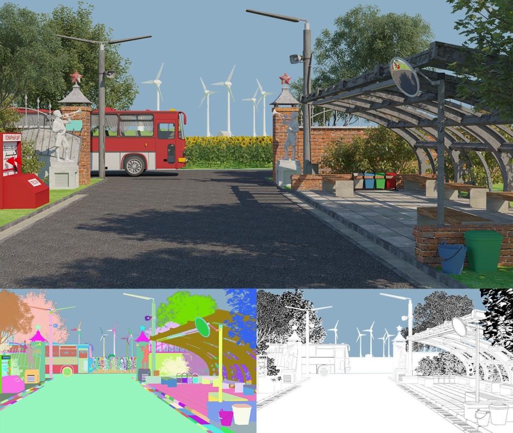
Lastly, render all your images in the largest possible size, so they will work more colorfully in post-processing.
What are the steps you go through in Photoshop to get the final look?
After all the rendering is done, I load all the passes into Photoshop. First comes our main beauty pass. Then over it I arrange all the ID layers that I will use as masks. Last, on the topmost layer, is the AO pass, set to Multiply to get the cartoon-comic style of our images. I always adjust its transparency to my taste, and sometimes the lines can be colored for greater expressiveness.
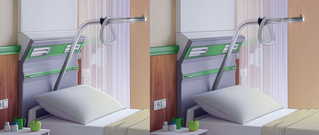
Well, now about the processing of the image – one of the most important layers in our image is the so-called “shaped light”. It is widely used in Japanese animation. The principle of it is that all objects in the scene have a bright stroke of reflected light. It is not always physically correct, but it gives contrast and improves the “readability” of the objects. The layer I use for this is set to Overlay mode in Photoshop, and then I draw white colored lines around the edges of the objects.
On the example above you can see the original version on the right, and then the version on the left has the “shaped light” added – you can see this effect particularly clearly on the pillow and on the bedside table, for example; but if you look closely you will see it in many other places in the image too. It seems like such a small thing, but the image looks much better once it is added. You can experiment with the brightness and color of the line as well.
A second layer will be for the warm light; I select the objects using the ID layer and then add a stretch of yellow and orange light to them. I do this with the cold light as well.
We can also use the Gradient tool to make our image even more flat and cartoonish. Also, using the Gradient tool can help point out some object; for example, if a small fir was lost against a background of large ones, then I can add added dark gradient beyond it and the readability improved immediately.
After that, I create a layer for the brightest parts of the image and draw bright glares with a brush. Things such as reflections, clouds, rain, fog, smoke and dust I draw with the help of Photoshop brushes.
You created images for the game ‘Big Dipper’ – how did you get to be involved in that? Any unique challenges to creating images for a game?
I joined the “Big Dipper” project in 2016. I lived in Irkutsk at the time, working as a teacher in a design department. I decided to take part in a visual short story competition that I saw on 2ch.kk (4chan analogue). I found a team of enthusiasts and together we made a small demo game version, which won 2nd place. After that, I was noticed by some people in Saint Petersburg and I moved there.
Probably the most difficult thing in working on any project is self- discipline, and planning your work. My task was to make the house of a young man who lives in a forest and makes furniture.
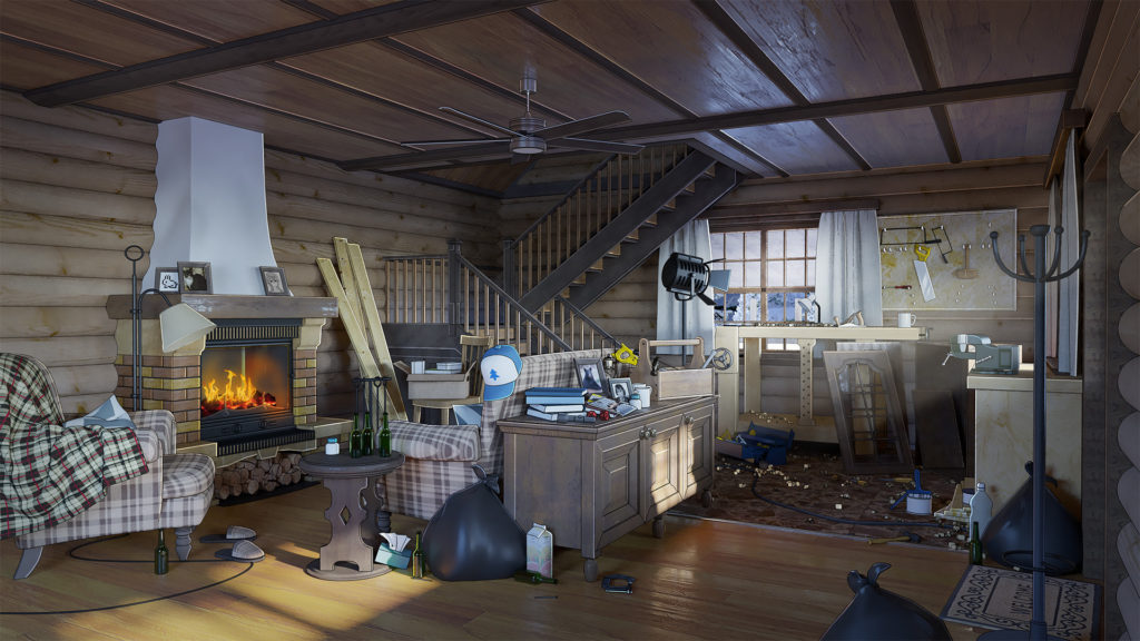
Since the action in the game took place only in this house, and the scenes constantly changed dynamically, I had to think through the different conditions that the house would be seen in. According to the plot, at the start of the game this guy lives alone, then as the game progresses he meets a girl and she brings some coziness to his house.
So the first question was, what would the home of a lonely guy look like? Certainly not clean and tidy, I thought. What I did was to create a neat room initially; I laid out the carpenter’s tools on the shelves, placed books and mugs, furniture, and so on. Everything was in its place – and then he began to cause a mess!
In that way, I got a typical lonely guy’s home. I worked with the light to specify a mood for the room – at the beginning, where the character lives alone, there is a cold color that dominates the room. However, in the next background when the room is already cleaned, I added a warm, evening light that gives a coziness and warmth to the house. In the final image, the night and the New Year tree were added. The fireplace became the point of interest. The light helps us to control the viewer eyes.
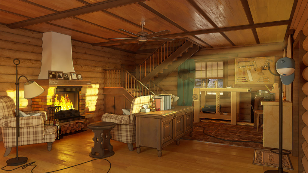
This small project helped me to decide on my future and gave me a lot of experience. Alas, the game itself is no longer available, but you can see some images from it here in the blog.
Any projects you are working on just now that use Corona Renderer?
At the moment I’m making backgrounds for already mentioned visual short story EON. The game is about Soviet retro-futurism and journeys to the other worlds.
What are your plans for the future in 3D?
I am planning to develop further – I want to achieve the same level of quality in my images as my idol Makoto Shinkai has.
Links:
Artstation
ckleroz@gmail.com
Thank you for your work! One thing i can’t understand is how did you get AO pass with such sharp contours of objects using Corona AO, even on objects that stand alone like buckets fo example. Your advice on this one will be appreciated
Hi Michael! Apologies for the delay in getting your question approved – just in case the artist doesn’t see your question here on the blog, their Artstation and email is at the end of the article so you could always contact them via those options. Thanks! Tom